08 Feb The Ultimate Guide for Using Heat Maps to Increase Conversions
[ad_1]
What makes website visitors almost convert?
What makes them browse a product page and then abandon the shopping cart at the last second?
What aspects of a landing page light up customers, and what slows them down?
Imagine if you had a friend who knew the answers to these questions. That would be quite helpful right? Analyzing conversion problems without embarking on a process of trial, error, and experimentation.
Well you kind of do, in heat maps.
Heat maps are visual overlays based on website data that allow you to see how visitors behave and why they behave in a certain way. Visually, a heat map has the appearance of an infrared display with color variations indicating high and low levels of activity.
It’s like watching the weather forecast, except the data is always spot on. There are several variations that can be used, and depending on your needs you can design a format that aligns with user behavior.
Types of heat maps
1. Click heat maps:
This is the most common type you’ll see. Click maps present the actual actions taken by visitors in the form of mouse-clicks.
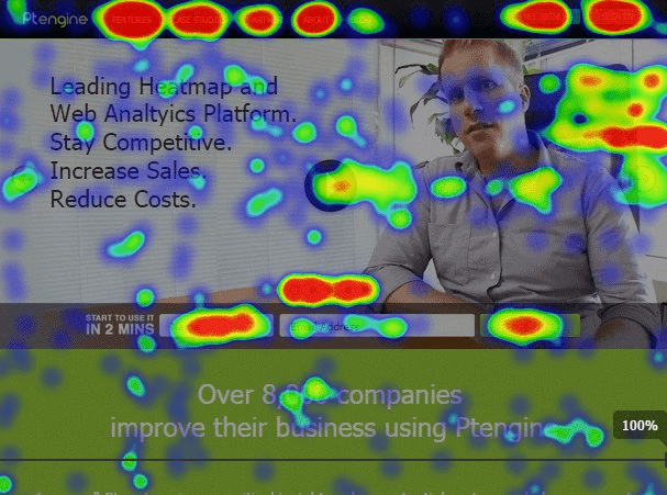
Source: VWO
2. Eye-tracking heat maps:
Eye-tracking takes things a step further. This method uses the entire subset of visitors’ interactions, actually tracking cursor movements and producing a sequential path, indirectly indicating the eye-movement of the visitor.
The eye-tracking map below hasn’t been sequentially numbered but you can see that the baby’s face gets most attention. The pile of diapers? Not so much.

Source: Kissmetrics
3. Scroll-tracking heat maps:
The Nielsen Norman Group found that 80% of visitors’ attention is spent above the fold. That is an important piece of information if your current landing page runs down into oblivion, like this one:
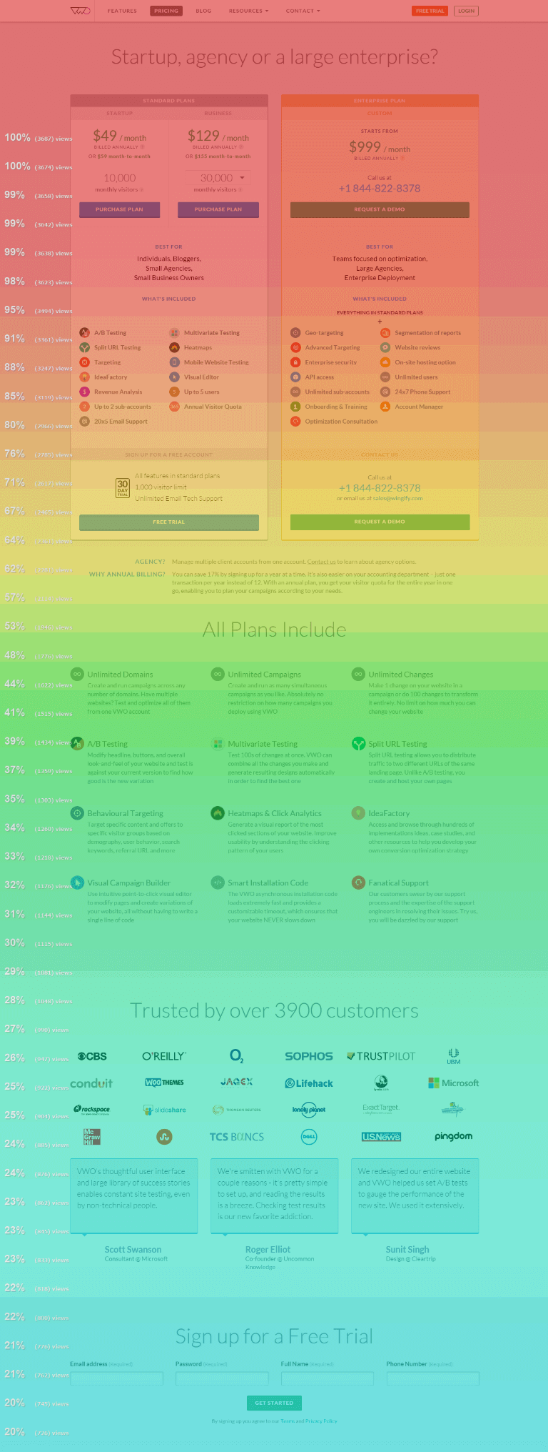
Source: VWO
Getting Started with Heat Maps
Now that you know what heat maps are, you need to start building maps based on your data. To do this, you’ll need to enlist one of the various services out there that offer heat maps as a specialized service. Look around, but you can start by checking out Domo, Arcalea, Feng-GUI, Attention Wizard, ClickTale, or Crazy Egg.
While each has its quirks, they will generally have you install a code snippet on your site, usually into the header or footer. Some of these even offer a free trial, so you have very little to lose by giving it a try, and a great deal to lose by opting out. One study estimated that less than 14% of websites are employing this technology today. That’s a competitive advantage for the taking.
Case study #1: Bringing Invisible Issues to Light
Now you’ve understood the concept, but you still need to know how heat maps can be effectively utilized to increase conversions. There are numerous possibilities here, so let’s start by looking at a general example that illustrates the various insights a heat map can reveal.
The truck and trailer breakdown service TruckersAssist was befuddled at the fact that their sharp page design wasn’t converting traffic. They turned to TechWyse for help, and TechWyse turned to heat map technology.
Here is the original landing page, which by many accounts is clean and professional:
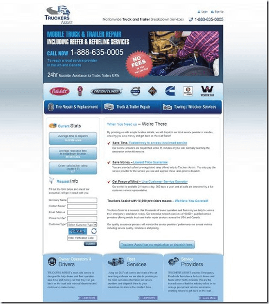
Source: TechWyse
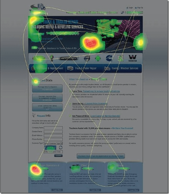
So what’s the problem? Take another look at the landing page with the heat map applied:
Source: TechWyse
The heat map above represents only about 5 seconds of a visitor’s time, which is a great snapshot of the thought process leading to either a conversion or a bounce. With careful analysis, a variety of issues that were previously invisible, or at least inconspicuous, jump out into plain view.
- Take a look at the red “NO FEES” sticker at the top. It has no clickable action and yet it is getting loads of attention.
- If you zoom in on the image, you’ll see the numbered path the eyes followed. See how it is bouncing all over the place? This suggests some re-organization is in order.
- There’s an action button at the very top that no one is even looking at. That’s a conversion item.
- The information request form on the lower left is below the fold for most viewers, which means that another primary conversion item is being passed over without notice.
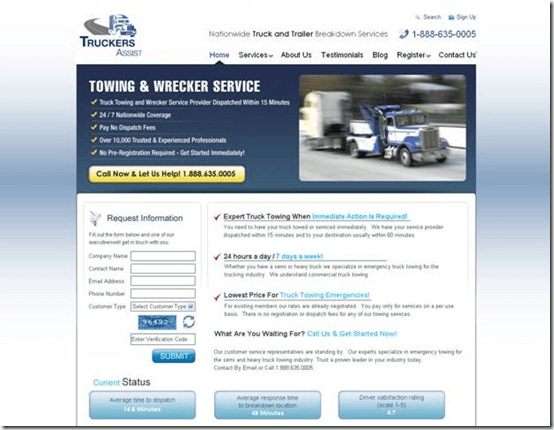
After some tweaks and a couple trials, here is the final revision:
Source: TechWyse
The main tasks were to remove clutter and move the points of focus to the action items. Notice they changed the color of the truck in the image to blend with the page. This would allow the image to serve its function while not necessarily drawing all the attention away from the action items. The page is simpler and the content is brought up above the fold. You can see that the emphasis is on the yellow call-to-action, and the information form is placed in plain view.
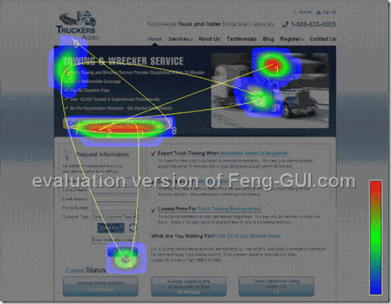
Here is the final heat map:
Source: TechWyse
Perfect. The visitors see the image but aren’t fixated on it. The primary call to action button is the main focus of activity. In fact, if you follow the path you see that the visitor returns to the button several times throughout this extremely short time span.
The thing to remember here is that the page they started with wasn’t overtly disorganized or ugly. A CRO specialist may have been able to pick out what changes needed to happen, but the heat map lets the actual visitors tell you what needs to happen. That’s power.
Case study #2: Navigation Bar Woes
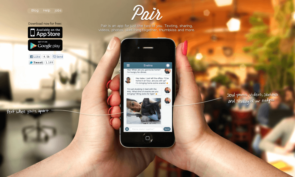
Couple, an app for—you guessed it—couples, used to go by the brand name Pair. At that time Pair had a simple landing page allowing visitors to download the app or access others pages. You can see it here:
Source: VWO
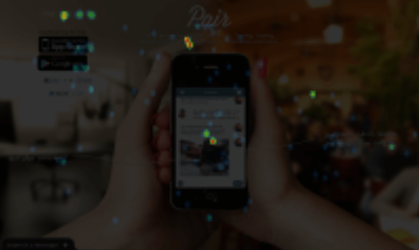
Simple and yet focused, right? Well, not so much, says Lim Cheng Soon, Pair’s resident growth hacker. Soon wanted to make sure he was getting the most out of his internet real-estate and so he enlisted Visual Website Optimizer to record a heat map. This is what he came up with:
Source: VWO
Lim explained what he took away from this picture:
I found out too many people click on the navigation bar on the top instead of clicking the conversion button (link to AppStore and Google Play). So I made up a theory that having too many “distractions” around the conversion button wasn’t such a good idea.
So I do a couple of A/B tests based on the theory of removing the “distractions” around the conversion button. Such as hiding the navigation, hiding the social sharing button, hiding the “Download for Free” text. I even do “counter theory” test as to prove my theory wrong by having a larger “Download for Free” text.
And turns out, my theory was almost correct:
Hiding “Download for Free” text above the button gave a 10% increase of conversion.
Hiding navigation menu gave a 12% increase of conversion.
Hiding social sharing icons (facebook, twitter) wasn’t so good, a 34% decrease in conversion.
Having a larger “Download for Free” text (my counter theory) gave a 42% decrease in conversion.
Based on the result of A/B testing, I did a new version of a homepage for split testing by moving navigation menu to the footer (instead of header), hiding the “Download for Free” text, but keeping the social sharing icon intact. And the result? 25% increase in conversion. Win!
This is a classic example of the “less is more” approach to landing pages, which is profound since the landing page was already fairly simple in its design.
The takeaway? Even a very minor menu bar can distract the visitor. And don’t clutter the CTAs.
Case study #3: All Those Abandoned Carts
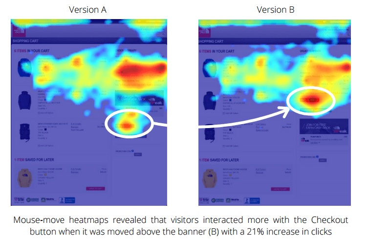
The North Face is a popular sporting goods apparel brand. They realized that their shopping cart pages were getting plenty of traffic, but that the Checkout button wasn’t getting any attention. For a solution they turned to ClickTale, a provider of click analysis heat mapping, to find out what was happening. Here is the map they came up with:
Source: ClickTale
In brief, there was a promotional banner right above the Checkout button that was hogging all of the attention. By moving the Checkout button higher they were able to take steps toward solving the problem. The North Face was thrilled with the outcome in terms of conversions.
More Conversion Improvement Takeaways
It wouldn’t be difficult to go on for days about the discoveries made possible by heat maps, particularly when it comes to increasing conversions. Here are some of the more insightful points to keep in mind:
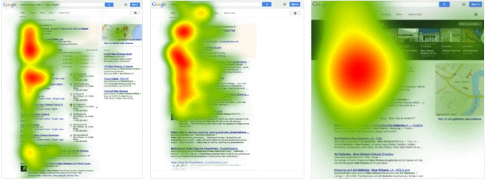
- People look left: Visitors spend more time looking at the left side of the page. That’s why, even though Google said not to put ads on the left, Dennis Publishing did it anyway. After testing 8000 visitors they found that the move had increased CTR by 74.5%. After taking the change site-wide they increased their RMP (revenue per 1000 ad impressions) by 48%.
Source: Search Engine People
- Attention span decreases with scrolling: We already mentioned this study above, which found that 80% of visitor attention is above the fold. What we didn’t mention is that the same study found a spike in engagement when the very last elements are reached. That means that if you must have a conversion element at the bottom, have it at the very bottom.
- What you see is what you buy: A recent Caltech study found that when it comes to high speed shopping, visual impact influences purchasing more than consumer preference. That means you need to make your conversion elements pop.
- Don’t use carousels: They’re nice if your audience doesn’t have any specific goal or item in mind, but if that isn’t the case they’ll completely ignore them.
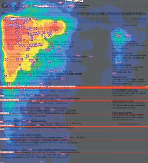
- The upper-left is the focus: According to an Eyetrack III study, people fixate on the upper left of the page and only after some time do they begin exploring down and to the right.
Source: Brain Box Web
- A/B testing is important: CareLogger, a health tracking service for diabetes patients, pulled off a 34% increase in conversions by changing the color of their call-to-action button. Sometimes there is no rhyme or reason to the change that needs to be made, and so heat maps in combination with A/B testing can work wonders.
There you have it. Heat maps are a marketing force to be reckoned with. Sure, you can tweak and experiment to your heart’s content and you might catch an insight here and there if you pay attention. But why not take advantage of the hard lessons and research of others so that you can get straight to the conversions and skip the heartache?
[ad_2]
Source link
Social Media Agency, Social Media, Digital Marketing, Digital Marketing Agency, Search Engine Marketing, SEO, digital marketing agency dubai, video content marketing, crossfit marketing dubai, video marketing dubai, digital marketing agency abu dhabi, facebook marketing dubai, facebook marketing abu dhabi, digital marketing agencies in dubai, social media agency, content marketing dubai, content strategy dubai, branding dubai

