23 Jul The chatbot playbook: What they should offer, how they should work
[ad_1]

What’s all this chatbot goodness?
Chatbots are computer programs designed to talk to you as if it were human, and you’re probably already using them whether you know it or not. Some are even positing that chatbots will replace webpages.
True or not, they’re increasingly relevant and many of our readers are (a) developing the next generation of chatbots or (b) considering how they should be used in their own businesses.
So in that spirit, the following is a piece by Sebastian Krumhausen over at Chatbots Magazine, the best place for learning about chatbots. Krumhausen has put forth “The bot playbook” and of the endless attempts at a manifesto that we’ve found, his is by far the best.
In his own words below, Krumhausen’s Chatbot Playbook:
The bot playbook
Organizations create style guides to capture the rationale of their design decisions and help other teams build great experiences. You might have read gov.UK’s service manual or the U.S. Digital Services Playbook. I wanted to do the same for chatbots build on the Facebook’s messenger platform.
At Sure, we are creating an online assistant that helps you find food and drinks that are better for yourself and the planet. It is still very early days for bots, so I wanted to take the opportunity to share some of our early learnings.
Chatbots should make life easier
Computers should know things. With a minimal amount of input from the user, the bot should be able to provide value by leveraging stored information. The bot should be aware, even anticipate the needs of its users and meet those needs with minimal friction. It should automate the kinds of tasks users would normally do on their own like make a dinner reservation, add it to the calendar and share it with friends.
A bot should save time and relieve stress by reducing friction and effort. Otherwise it is not much better than the website or app that came before it. Integrations and contextual relevancy are key elements to the experience.
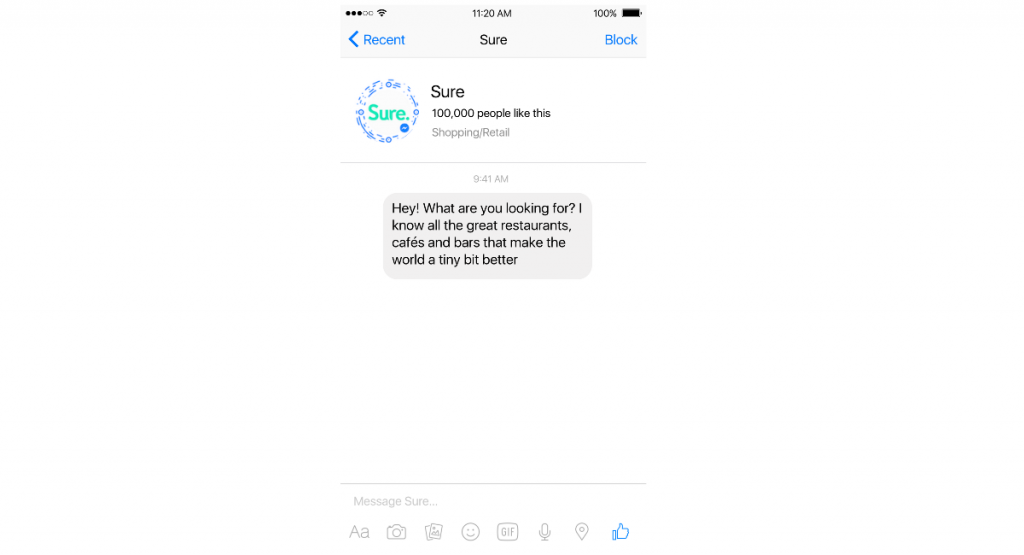
The bot should introduce itself
A bot should always introduce itself and explain what it can do. As with any other experience, there is a slight learning curve so you will need to onboard new users. You cannot expect your users to figure it out themselves. Use the first message to tell the users what they can do and suggest a first task.
Short introduction and call to action.
Continuous support
Continue to provide information and useful actions for a continued positive experience. Help and documentation should be accessible via the bot itself. Commands like “help”, “settings”, “start over” and “stop” seem intuitive to most users, make sure your bot responds to them.
Always suggest the next step
A bot should drive the conversation forward and at times even restrict it. Consider suggesting things to do; this will help users discover additional functionality.
“Hey bot, book a table.”
“Table reserved. Would you like me to order an Uber?”
Bot interactions are a bit like the traditional e-commerce flows. We should constantly keep the user updated and help them move forward, while avoiding overwhelming the user with a wall of information.
Start simple, but quickly add power features
Not showing all features up front will make the interaction less wordy and faster for new users. Every extra bit of information competes with the relevant units of information and reduces their relative visibility. Once the user start to understand what the bot can do, you can gradually remove the training wheels and reveal more functionality.
Continuously showing expert features will make the experience more efficient for power users. You can help users discover power moves by proactively providing small tips about additional functionality.
Interactions will be short, and that is okay
Screen real estate is very limited on a mobile device so you will want to keep messages short and concise. Also, users tend to skim if they read at all. The bot should mimic human behavior. Long messages sent too fast are very hard to comprehend and will quickly become overwhelming. You do not want the user to have to scroll back up to read the whole message.
Chatbots are part of the transitional journey from graphical UI to no UI. Contextual and previously stored information means that chatbots will be able to shorten complicated flows. Purchasing products and confirming appointments will be as simple as a single click or message.
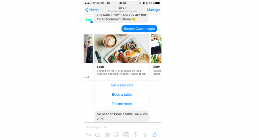
Short user flows.
A hybrid experience is the way forward
Messaging apps let us remove most interface elements and reduce the experience to a simple message thread. Chatbots live within messaging apps and users are already accustomed to communicating with friends using text, but text input is not efficient for all use cases. The GUI replaced the text-based terminal for a reason and some tasks like browsing and selecting is faster with touch or click.
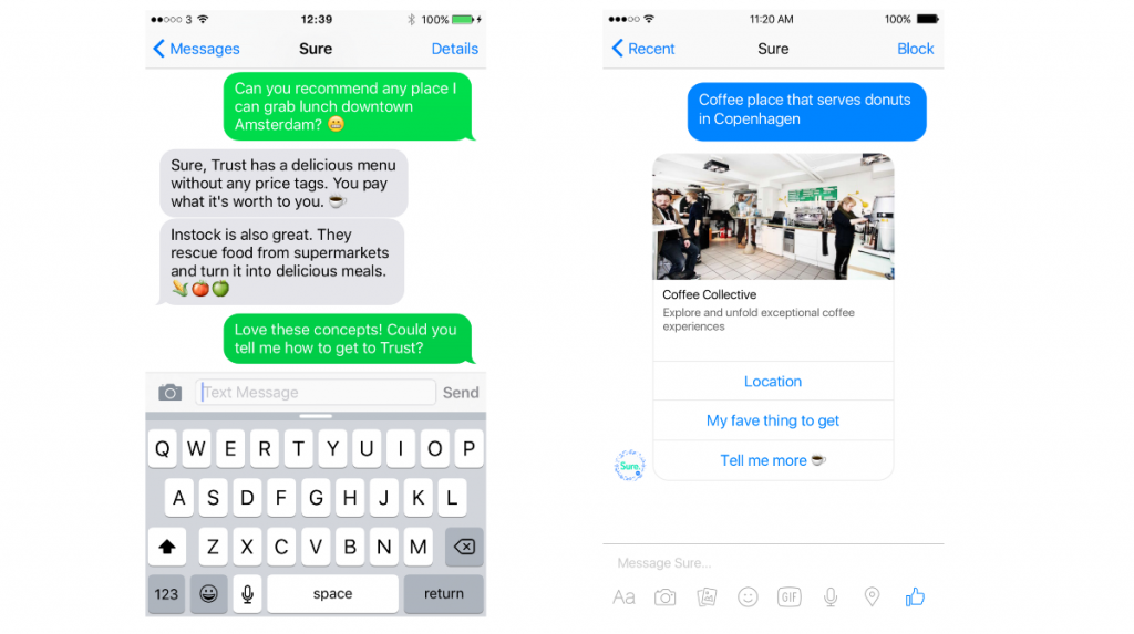
Images and structured content is an excellent way to present information in a more interesting way. Over-reliance on structured messages, however, will feel artificial as you lose the conversational element.
Left is text only. Right structured messages.
Interactions should be simple
The number of paths a conversation can take increases the potential for dead ends. It is better to limit the functionality and nudge the user down a particular path. A simple solution is to use structured messages to guide the users. Rather than asking the end user to type “yes” or “no,” show a structured message with two buttons.
Personality makes the experience more pleasant
The content can stay minimal, but the medium does not have to. There is a clear distinction between the content and the delivery; the what and how. When users chat with the bot, they expect clear answers. However, you can use the opportunity to add a bit of flavor to the message. Adding different versions is also an easy way to add a bit of personality.
Brands often have a bespoke tone of voice; an e-commerce site might sound friendly whereas a lawyer would probably be more professional. Know your audience and choose a communication style that fits with your customers and brand. Messaging apps also cater to different types of communication.
Users of Sure have sent pictures, audio messages, and emojis. They share their feelings and emotions, positive and negative, they also use humor when chatting. Bots exist in the same space where you would normally interact with a friend. If you remove the text and personality, are you not just left with a simple, inefficient mobile app?
Start off with a focused chatbot
A bot needs a clear value proposition. Why else would you use it? A focused bot that does a few things right is more useful than ones that barely breaches the surface. Also, natural language processing is hard. We still have long to go before machines fully understand the complexity of human communication. In the meantime, it is better to build a focused chatbot. Chatting to a dumb chatbot is no different that using an automated telephone service?—?nobody likes those.
Reply, always
The bot should always respond, even when it does not understand the user. Saying “Sorry, I did not understand you” is better than ignoring the user?—?adding a bit of humor to the message is even better. Backend services might delay the bot’s response, in that case the typing indicator or a message like “Hey, still thinking about this…” is a delightful micro interaction and a simple feedback mechanism.
#ChatbotPlaybook
[ad_2]
Source link
Social Media Agency, Social Media, Digital Marketing, Digital Marketing Agency, Search Engine Marketing, SEO, digital marketing agency dubai, video content marketing, crossfit marketing dubai, video marketing dubai, digital marketing agency abu dhabi, facebook marketing dubai, facebook marketing abu dhabi, digital marketing agencies in dubai, social media agency, content marketing dubai, content strategy dubai, branding dubai


