09 Dec Keep ‘Em Coming Back: 3 UX Tweaks to Increase Repeat Purchases
[ad_1]
The UX design of your store is probably why you aren’t getting any sales.
Most people coming to your online store are there just to fulfill an immediate need, not build a relationship with your brand. After they fulfill that need, it’s difficult to get that buyer to come back again.
But, if you can convert even a small percentage of those one-time buyers to repeat customers you will increase your revenue substantially. In fact, upping customer retention rates by just 5% can increase profits up to 95%.
What most ecommerce owners don’t realize is that the key to improving their repeat purchase rate lies in their user experience (UX).
Fortunately, there are 3 simple UX tweaks you can make to improve your repeat purchase rate (without breaking the bank on a complete site overhaul).
1. Personalize The User’s Experience With Dynamic Content
Personalizing the content customers see on your website can hugely impact the way they view your brand. 61% of consumers have a higher regard for a company that delivers custom content. (source)
‘Higher regard’ means they trust the brand more and are therefore more likely to buy.

If a customer returns to your site after a purchase and sees products similar to what they recently purchased on the home page, chances are they are more likely to convert.
Considering that, it’s no surprise why Amazon is the clear frontrunner in online retail: Their personalization strategy is top-notch.
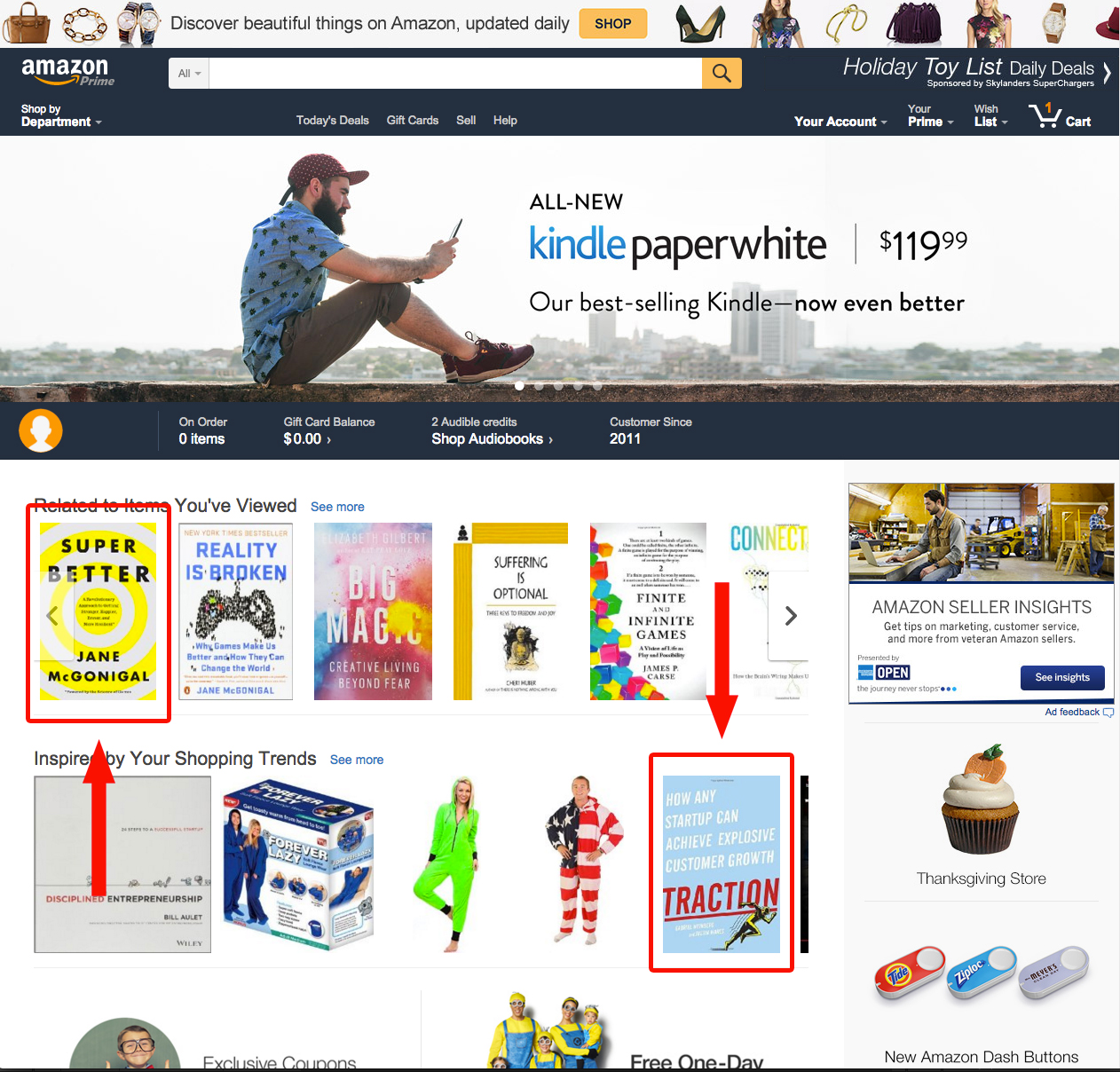
After an item is purchased from Amazon, the customer’s home page is updated to reflect similar products. For example, here’s my Amazon home page after I bought Ben Horowitz’s book, The Hard Thing About Hard Things.

There are two books displayed that I’m interested in reading, and they’ll probably turn me into a repeat purchaser.
Don’t worry: You don’t have to be an Amazon-sized online store to nail personalization. There are a couple of tools you can use to personalize your store without doing an extreme shop overhaul.
One tool that’s easy to get up and running is Dyno, which allows you to display different copy based on your traffic channels.

For example, if you’re running a Facebook Ad campaign, you can create a specific version of your landing page to only show to visitors from Facebook.
Another tool I recommend is Unbounce. It allows you to create personalized landing pages and A/B test them so you can gather knowledge about your audience.
Once you judge what landing page is performing better, you can double-down on that ad channel and watch your conversion rate rise.
2. Make the Checkout as Painless as Possible
Problems during the payment process have forced two-thirds (66%) of shoppers to abandon their transactions.
The first problem with most checkout process? Too many steps.
People are impatient. You can’t expect them to complete a 10-step checkout process when Amazon has a one-click checkout feature.
You don’t have to be a large company to create an optimal checkout. Reducing the amount of steps in your checkout can be easily approached by asking a few questions:
Your answers to the above questions will help highlight areas that, if changed, can speed up your customer’s checkout process dramatically.
The second major problem many brands struggle with is their mobile checkout design.
In comparison to desktop, viewing and understanding a mobile shopping cart are very different user requirements.
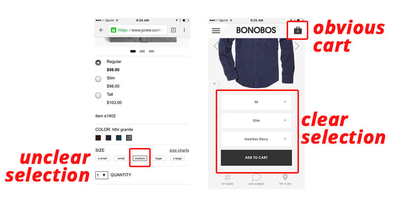
As the customer’s screen gets smaller, the elements of your store have to condense yet still remain important, visible, and usable. Take J.Crew’s mobile process compared to Bonobos:
When selecting a size on the J.Crew site, it’s very unclear that I’ve selected a medium. The size is outlined very subtly. The shopping cart (an element that should always be present) is nowhere to be seen on the screen.

In comparison, Bonobos’ product pages are optimized for mobile platforms. Size and color is chosen in a dropdown, so it’s clear what I’ve selected. The shopping cart remains present and large in the top right-hand corner, easy to select without scrolling.
To optimize your own checkout, start by going through the process yourself on your ecommerce site.
When you try to purchase something, where are you getting frustrated? Your customer is most likely feeling the same.
Assuming you have Google Analytics set up, take a look at both the percentage of mobile visitors (those arriving to your site using a phone or tablet) and the bounce rate of those visitors.
First, if the bounce rate is high on a product page, you need to address the user experience of your product page design. Like my comparison of the J.Crew and Bonobos product pages above, there are nuances in the design that can make a difference in the visitor purchasing that product.
Second, if you have funnel-tracking set up, look at your shopping cart abandonment rate for mobile users. If it’s high, there’s a good chance your overall mobile checkout process needs a redesign.
Ask yourself these questions to begin your analysis of your checkout user experience:
- Are my product variations easy to view / select?
- Does my user understand what options they have selected?
- Are my products easily added to the shopping cart?
- Does my user understand their products have been added to the cart?
- Does my checkout process have unnecessary barriers?
- Is my checkout process easy to complete?
Begin by reviewing your process with the above questions as a starting point. Your answers will arm you with a better idea of what specific elements need to be improved.
3. Optimize Your Digital Receipts
One of the most personal and effective channels is your customer’s inbox. Don’t hold it sacred for newsletter and informational mailings only – use your digital receipts to engage with your customer and give them an opportunity to purchase from you again.
Adii Peiner, founder of Receiptful, gives us a glimpse into the revenue that can be generated just by sending a digital receipt:
4) The average value generated by a receipt is $0.27 USD. (Using total, additional revenue generated by in-receipt marketing.)
— adii (@adii) February 25, 2015
If you can recoup an average of more than $0.25 from just sending a receipt, imagine the sales you can capture once you begin optimizing that channel!
In the receipt, include links to items similar to what was purchased. Generate a one-time discount code with a nearing expiration date to encourage them to spend. Offer a referral incentive. The possibilities are vast.
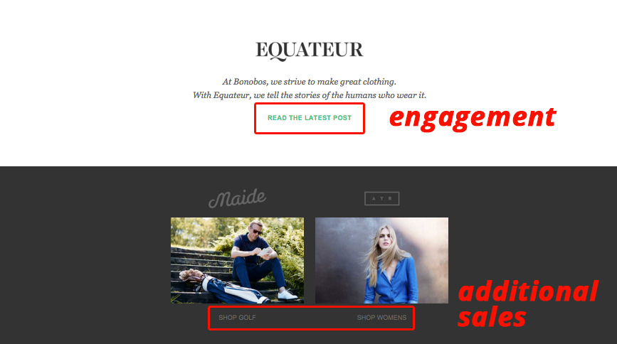
Take Bonobos for example (again). The below image is an example of an email receipt from them. Along with my order details (not shown) the company offered me various ways to engage with the brand, including a blurb about their “Equateur” blog.

There are also links to two product categories that are different from the category I purchased from. This is a smart play.
Perhaps the customer is a woman unfamiliar with the brand, buying a product for her boyfriend. When she receives the receipt, she’ll most likely be inclined to take a look at Bonobos’ women’s clothing line (especially if she had a great experience).
To get started with your own digital receipts, I recommend looking at Receiptful.
If you’re on Shopify, you can check out ReferralCandy, which allows you to create referral campaigns for your store.
Most of all, make sure you know what your options are before you get started.
Conclusion
Every ecommerce owner I know wants to make more sales. Identifying one element of your user experience that needs improvement can kick start this process.
Your user experience is the lifeblood of your store. Happy users = more purchases. Apply this rule to your business and you’ll start seeing ways you can improve your customer happiness.
How have you tweaked the user experience of your online store to improve your repeat purchase rate?
About the Author: Allen Burt is a serial entrepreneur and founder of Blue Stout, a digital agency specializing in ecommerce solutions. He also heads up the Do It Better blog which delivers articles and in-depth case study analyses of ecommerce companies. You can keep up with Allen on Twitter to learn about his outdoor adventures and read up on his startup advice.
[ad_2]
Source link
Social Media Agency, Social Media, Digital Marketing, Digital Marketing Agency, Search Engine Marketing, SEO, digital marketing agency dubai, video content marketing, crossfit marketing dubai, video marketing dubai, digital marketing agency abu dhabi, facebook marketing dubai, facebook marketing abu dhabi, digital marketing agencies in dubai, social media agency, content marketing dubai, content strategy dubai, branding dubai

