13 Jun How ‘Visual Cues’ Can Drastically Improve Page Performance
[ad_1]
It only takes 50 milliseconds for people to decide to leave your website.
That’s how powerful (and quick) first impressions occur online.
And unsurprisingly, 94% of these first impressions are design related.
But most people mistakenly think design is how something looks. One smart dude once noted the difference, explaining that design is more concerned with “how it works“.
Online, that means using things like ‘visual cues’ to help aid how visitors interact with your pages. And the good news is, that using visual cues to improve your page performance isn’t difficult.
In fact, it’s as simple as not making people think.
Here’s how to do it.
How Web Design Visual Cues Can Help You Design for Scanners & Multitaskers
Design trends are good. They keep things fresh, evolving the standard paradigm to infuse new ideas to make your brand more memorable. But sometimes, things can go too far.
For example:
Parallax is to design what QR codes are for marketing. Kinda fun to look at or play with, but utterly useless in reality.
It’s design for design sake, instead of serving a verifiable purpose like improving page conversions.
Flat design, another widespread design trend today, is mostly good. Until it isn’t.
For example, one common flaw when implementing flat design (improperly) is to strip away form field colors and borders, leaving fields naked. That often makes them indistinguishable from other page elements, hard to find and easy to miss for most users.
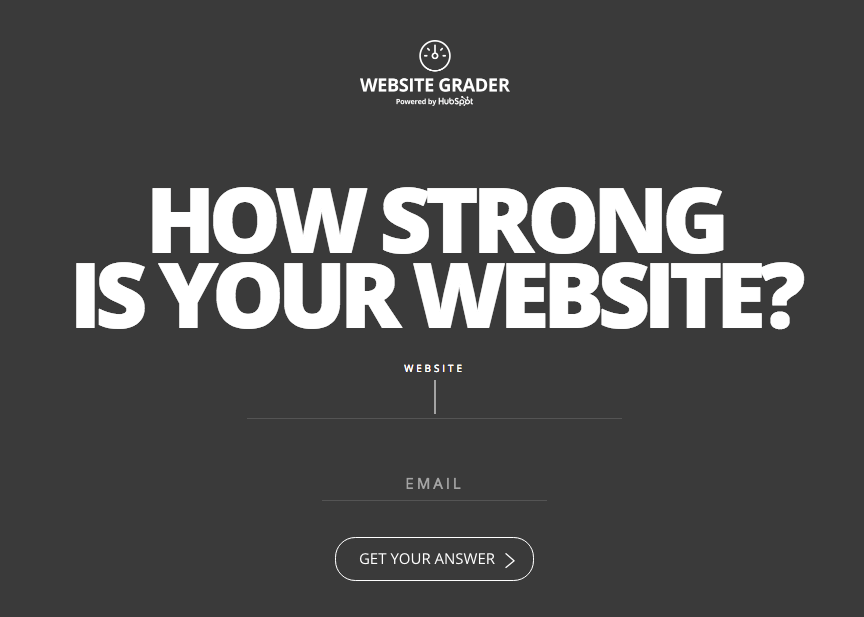
Contrast that to this HubSpot example, which manages to find a good middle ground, using visual cues like the lengthening of an underlined text field (as well as placing a blinking text cursor) that helps to nudge you in the right direction.
Point is, good interactive design isn’t about art or trends. But about use.
If you want to understand the basics of usability design, you don’t need a fancy art degree. You just need to spend $30 bucks and one hour reading Don’t Make Me Think by Steve Krug (whose premise is… well, obvious). That’s definitely NOT an affiliate link. Just highly recommended. Get the old school paperback version so you get the visuals.
This excellent, actionable read help you understand how to think through user interactions (in plain English), giving you pages of notes with ideas to go back and tweak your own site.
For example, the third chapter, Billboard Design 101: Designing for Scanning, Not Reading, offers a few principles related to using visual cues online:
- Take advantage of conventions: ‘Conventions’ are standardized design patterns, and help to quickly orient visitor’s even if it’s their first time landing on your site. Here, opt for clarity over cleverness. For example, use ‘About’ instead of ‘Why Us’ or some other variation.
- Create effective visual hierarchies: ‘Visual hierarchies’ help users understand what’s on a page, the relationship between those things, and how they should logically proceed in consuming those things. Visual cues can be powerful, like using nested page elements to suggest context or subset information.
- Break up pages into clearly defined areas: Breaking a page into ‘clearly defined areas’ helps visitors scan for groupings of information they’re interested in, before drilling down for more detail. If not careful, this can be another area where lazy flat design becomes problematic, because it doesn’t clearly delineate where page content sections might be changing.
- Make it obvious what’s clickable: Exactly like it sounds. Websites and landing pages exist for some purpose. In order to achieve that purpose, you’re going to need users to click, enter, submit, or purchase. Using visual cues to help highlight exactly how visitors can do that make it obvious and easy for them.
- Eliminate distractions: Landing page design 101. Distractions or visual clutter can detract people from the page’s primary objective, causing them to ‘get lost’ in the site hierarchy or become too frustrated and confused to stick around on the site.
- Format content to support scanning: Countless studies have shown that people online scan. One reason? They’re mostly multitasking, with anywhere from 3 to 10 other tabs open at a given time. This concept is especially important for long page content, which is exponentially more difficult to keep people reading online than in a book or another medium.
Most of these principles are nothing new. They’re age-old interaction design fundamentals that go by many names, like framing, where the objective is to use design to set a page’s context.
Here are a few tips and examples for putting these principles into action.
Tip #1. Use Visual Cues to Make Navigation Easier
The UX design of an eCommerce checkout flow are one of the most obsessively monitored and tested design elements for good reason… they’re directly responsible for tons of money made (or lost). There’s a lot of subtly in play in a successful eCommerce checkout flow, but they all have an overriding principle; help potential customers understand where they’re at currently, and where they need to go (by visually highlighting the additional steps to convert).
These same principles can (and should) be carried throughout a website, especially those with many pages or a complex information architecture.
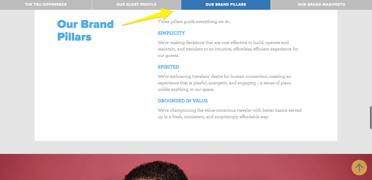
Secondary navigation options have typically been reserved for static use in sidebars. But you can make them more interesting (and useful) by mimicking the same eCommerce metaphor. This approach is especially useful for longer pages with a lot of content.
When my company recently designed Tru for Hilton, we used this approach on long scrolling pages to help remind users where they are when reading, and how to get around to other areas quicker.
A different, but similar example comes from Rainmaker.FM.
Blogs notoriously have TONS of content that can be difficult to navigate. But the Rainmaker design expertly includes a section under the current podcast episode to help you navigate their huge library easier. This approach is also more useful than other navigation options like pagination, which – let’s be honest, is a usability nightmare.
Besides the obvious arrows, placing the previous episode to the left and the next episode to the right also sticks to convention (where left equals back and right equals forward).

Tip #2. Use Progress Indicators and Anchor Links to Help People Consume Long Content
A recent study by Brian Dean and Backlinko showed the average word count for Google’s first page results hover around 1,890 words.
Compared to a book or magazine article, that’s not much. But compared to a standard, 2010-ish blog post, that’s HUGE. That means in the past few years, the expected word count length of a web page has grown almost 3-4x.
However as we’ve already noted, people aren’t necessarily reading everything in-depth. So that’s the trick: how do you deliver MORE content, yet keep people on the page (when they don’t want to read)?
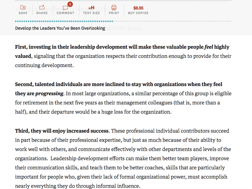
The Harvard Business Review provides an excellent example, with a sticky scrolling progress bar that shows you how much you’ve consumed (and how much is left). They also link out to a few helpful tools to get MORE out of this page.
We recently stole borrowed this concept, creating a sticky navigation for long form content that links out to each major subheading, helping the user click around if they want to scan deeper, faster.
You’ll notice this is similar to the Tru example above, just on steroids, to subtly guide readers down the page, encouraging them to scroll and scroll and keep scrolling.

Tip #3. Use Extra Visual Emphasis to Call Attention to CTAs
It’s easy to eliminate distractions, like menu items, on a dedicated landing page where traffic is being sent explicitly to a single offer.
It’s NOT so easy on a standard web page, where you’re often trying to get a few different points across to fulfill multiple objectives at the same time.
That’s especially true on blog posts, where you have to deal visitor’s who are more interested in the topic of the post being discussed (than learning more about you). That means despite being in a ‘permission based’ medium, you’re still gonna need to interrupt people to accomplish that first initial attention-grabbing step.
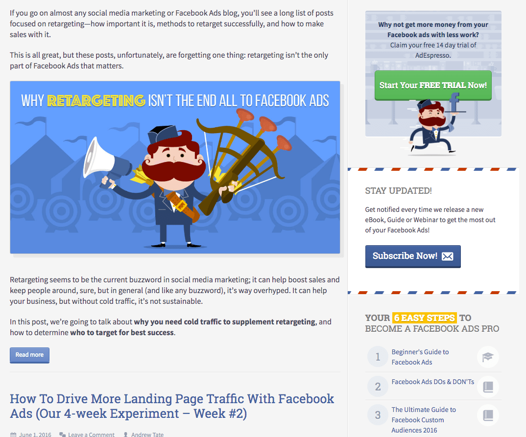
A perfect example on this very blog you’re reading is the colorful bannered border, as well as a different background color to call attention to the Stay Updated subscription box.
But one of my favorite recent examples comes from the Unbounce blog.
It’s become standard to locate a visual CTA at the end of a blog post. Problem is, visual adverts that become ‘standard’ also lose effect over time (similar to banner blindness). On top of that, people often don’t read an entire blog post today, so they may never even get to a bottom of the post-CTA on long-form content.
Placing CTA’s inline with the content can be a tricky balancing act to pull off. If it’s too subtle, users can skip right over it without ever realizing it was there. However too distracting or irrelevant can be offputting too.
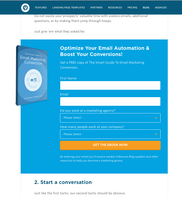
Unbounce uses a large, inline CTA at the end of one section (and before starting another), that advertises a relevant, topical offer based on what you’re reading. So despite it’s overly obvious size, the matching relevancy keeps you interested (instead of bouncing).
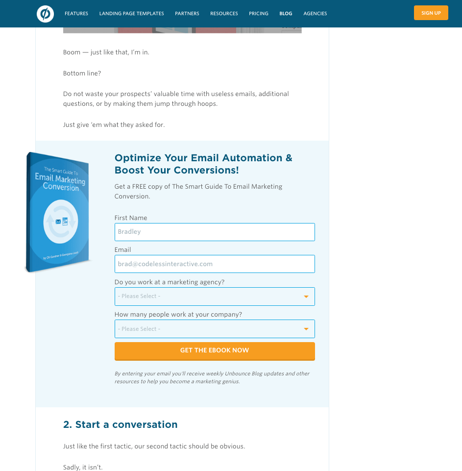
Beyond the obvious form fields that are outlined with helpful labels, this CTA also features a hover effect that brings the entire section into focus when you scroll down over it.
Conclusion
Your website visitor’s increasing expectations (and online ADHD) is only equaled by the increasing amount of competition for their attention.
That means your page designs need to instantly establish a good first impression to combat this. But they also need to somehow keep people around longer, helping them navigate to more pages and getting them to pay attention to important page elements that will also boost your bottom line.
Visual cues help support interaction, setting the page context so visitors immediately understand what’s going on, where to start, and where to go next. They can help them navigate complex website hierarchies, consume content on long scrolling pages without getting lost or bored, and call their attention to specific places on your site that directly link back to revenue.
Most brand new website visitors will never give you a dime, as average site conversions are only around 1-2%.
But the more often you can keep them coming back, and the longer you can keep them on your site, the better.
Visual cues make that daunting task easier.
What do you think?
[ad_2]
Source link
Social Media Agency, Social Media, Digital Marketing, Digital Marketing Agency, Search Engine Marketing, SEO, digital marketing agency dubai, video content marketing, crossfit marketing dubai, video marketing dubai, digital marketing agency abu dhabi, facebook marketing dubai, facebook marketing abu dhabi, digital marketing agencies in dubai, social media agency, content marketing dubai, content strategy dubai, branding dubai

