10 Aug How Tweaking Your Microcopy Can Instantly Boost Your Conversions
[ad_1]
So you want to boost your conversions. You’re probably thinking of your headlines, your layout, your copy. You know, the big conversion generating stuff. Maybe you want to try a more attention-grabbing headline, maybe you want to rearrange your layout to follow user eye movement patterns.
Focusing on the big stuff is good. The big stuff is important.
But don’t overlook the small stuff. In marketing, as in life, it’s often the small stuff that has the greatest impact.
The small stuff could be detail in your design, like the color of a button.
Or it could be a detail in your copy. That’s your microcopy.
Microcopy could only be three words long, but it’s very important. A small tweak in your microcopy could boost your conversion rates by as much as 161.66%.
Want to know more?
Read on:
What is microcopy?
So what is microcopy exactly?
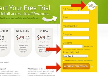
Microcopy is the the text on a web page that helps the users to do stuff.
Like this text on Zendesk’s sign up page.

Microcopy is found on:
- Buttons
- Form fields
- Form instructions
- Error messages
Microcopy is something we don’t think about much. But it has hidden power. It can make or break your user’s experience.
It can also make or break your conversion rate. More on that later.
Why is microcopy important?
Microcopy matters.
Here’s why:
It’s informative
Microcopy should be clear and eliminate confusion. On a form, it explains what you need your user to do and why. And it does this every step of the way.
For example, your form might ask for your customer’s phone number. This could put some people off – they don’t want to be bombarded with telemarketing calls.
Now you might explain that you only need their number in case you needed to contact them about their order. This would reassure your user and could make the difference between a sale or a lost opportunity.
It adds a human touch
Users like to interact with other people. Good microcopy makes users feel as if you’re there to take care of their needs. It gives them confidence that if there’s a problem, you’ll be there to help.
It builds trust
Users can be wary of handing over personal or financial information over the internet. If they’re not familiar with your company they can be doubly nervous. So you need to give them the reassurance that you’re credible and trustworthy. Good microcopy would handle any doubts a user has about registering, subscribing or purchasing.
It expresses who you are
When a user is considering signing up for something you offer, they’re about to embark on an experience with your brand. With carefully chosen microcopy you can shape users’ expectations right from the outset. So you don’t want bare, impersonal prompts.
Use your microcopy to express your brand identity. Be witty and engaging and you’ll win them them over right from the outset.
It helps conversions
Sometimes a user is interested in what you offer, but is hesitating about signing up. That snippet of microcopy can clear up their reservations and make them feel welcome. This can make all the difference to increasing your chances of converting them.
The secret to writing amazing microcopy
Want to know how to write amazing microcopy?
Read on:
Know your user
Writing microcopy takes more than good writing skills. The secret of writing great microcopy lies in getting under the skin of your users. Learn to understand what your user is thinking and feeling. Then show them that you’re on their side.
As Beth Dunn, HubSpot’s UX writer and editor says:
“There’s always got to be a sense of us being in it together”
Know your brand
As well as understanding your users you should have a clear understanding of your brand identity and voice. Your microcopy must be in alignment with your brand. If it isn’t, you run the risk of confusing your users. A great idea would be to create an internal style guide to ensure that your microcopy remains consistent with your brand message.
Show a bit of personality
Microcopy needs to be functional, but there’s nothing to say that it should be humourless. Sprinkling a few jokes, cultural references or irreverent remarks can actually enhance your user’s experience.
It shows the humans behind your brand and makes users want to engage with you, to get to know you better.
Check out this cheeky error message by MailChimp.
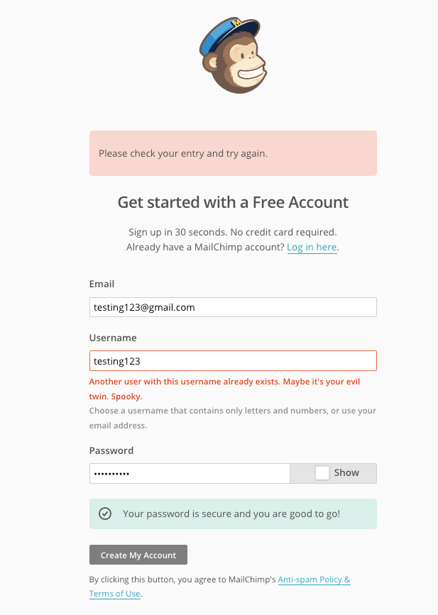
The error message reads: “Another user with this username already exists. Maybe it’s your evil twin. Spooky.”
Be helpful
If your user makes an error, your microcopy should be there to help them fix it. If there are errors in the form the user has submitted, don’t just flash up a “your form contains errors” message. Take the trouble to explain what the error is, and give helpful advice on how to fix it. For example, “It looks like the credit card number you entered is too short”.
Be concise
Users don’t want to read lengthy chunks of microcopy. Give them clear instructions and keep it simple and short. Avoid technical jargon. Your microcopy should be so simple that a child could understand it.
Be encouraging
When a user is considering signing up with you they’re often in two minds about it. They think you have what they need, but they’re not 100% sure. How can they be? After all, they’ve never used your products or services before.
Your microcopy can nudge them in the right direction by encouraging your users to take action. The best way of doing this is to provide some kind of social proof or reassurance. For example you could set out the benefits you offer, mention the number of satisfied customers you have, or cite a glowing testimonial.
Basecamp does this very well.
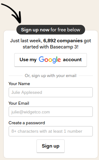
Basecamp informs their users that, “Just last week, 6,892 companies got started with Basecamp 3!”
How to identify opportunities for using microcopy
So how do you identify opportunities for microcopy on your web pages? Here are couple of reliable indicators:
- Low conversions: If an element on your page has a low conversion rate.
- User errors: If an element on your page is causing a high rate of user errors.
Even better, you can conduct usability testing to find where users are having problems on your web page. Listen to their feedback, it will tell you all you need.
Having said that, here are a few common opportunities for using microcopy:
To give a reason for taking action
Good microcopy tells your users the benefits they’ll receive for taking action. Don’t leave it to them to guess. If you want them to fill out a form, make sure you tell them what’s in it for them.
Sure, you may already have landing page that covers this in detail. All the same, a few well placed snippets of microcopy can reinforce your message and get you the conversion. Typically the microcopy will go in your form’s headlines and buttons.
Just look at Creative Market’s popup.

Creative Market informs their users that they’ll get “FREE graphics, fonts, themes, photos & more every week” if they sign up.
To answer why
Users don’t like to give out personal information, especially if they feel it’s unnecessary. In a usability study by the Baymard Institute, users who were asked to give personal details like their phone number often complained. However, the study found that users were far more receptive when a reason was given for needing their phone number.
Giving a reason why can not only boost compliance, it will increase trust as well.
Just look at this simple example.
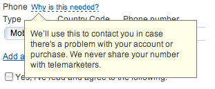
Users are told that their phone number is requested in case there’s a problem with their account or purchase. They’re further reassured that their number will not be shared with telemarketers.
Form headlines
Make it clear to your users exactly what they’re signing up for. Form headlines are a great way to do this. The way to make them effective is to make it clear to users what they’re getting when they sign up. They should answer the “what’s in it for me” question. If you can show they that what you have to offer is relevant and useful, you’ll get their attention.
Unbounce does this very well.
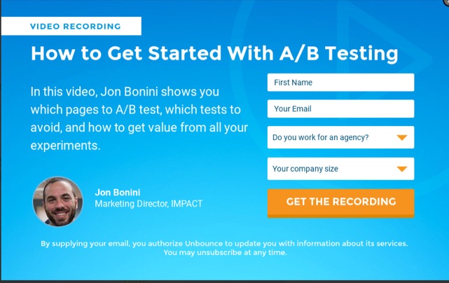
Unbounce lets their users know that they’re signing up so they can learn “How to get started with A/B testing.”
Form fields
Form fields are a necessary part of gathering information from users. But they’re often overlooked in conversion optimization strategies. Forms can be confusing, and users may make inadvertent errors in completing the fields. People aren’t going to stick around if the form is making things hard for them.
Helpful microcopy can give users the information they need and tell them what they need to do to rectify an error. This can make the difference between a user signing up or deciding it’s not worth the trouble.
Call to action buttons
Call to action buttons, or CTA buttons, are perfect for microcopy. They’re the last thing your user sees before they act. Consequently the microcopy you use here can have a huge impact on conversion rates.
Avoid microcopy that simply tells users to click that button. Create phrases which emphasise what they’ll be getting once they click. I cover this in detail in my post analyzing 5 great call to actions.
Look at this example from Akismet.
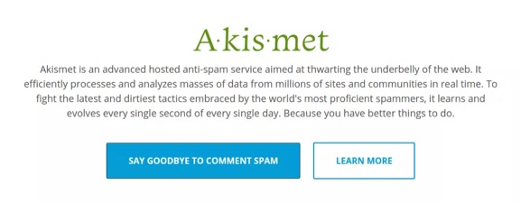
Users are invited to click on the button to “say goodbye to comment spam”.
In site search
If your website has a search bar it can be a source of higher conversions as it lets allows users find exactly what they’re looking for. So you should encourage your users to use it.
A good way of doing this is to put some of your popular search terms in your search bar. This will prompt users to use your search function as well as give them some great keywords to start with.
Yelp does this quite well:

By adding “tacos, cheap dinner, Max’s” and “San Francisco, CA” as suggested search terms, they subtly encourage their users to use their search function.
So can microcopy boost conversions?
Yes it can. And here’s the proof:
Veal
Veaam conducted an on page survey to give them valuable user feedback on their lead generation form. They found that many visitors wanted to know the price of their services.
So they changed the phrase “Request a quote” to “Request pricing”.
Before:
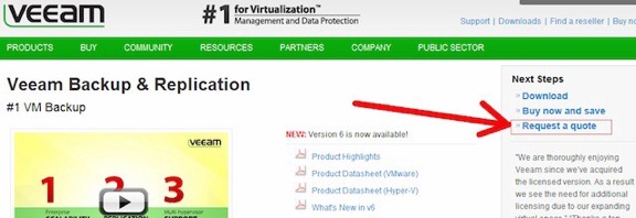
After:

The result?
An increase in conversions of 161.66%.
Content Verve
Content Verve added some microcopy to their signup form and conducted an A/B split test to measure the results. Their microcopy emphasised the benefits of signing up, thus encouraging their users to take action.
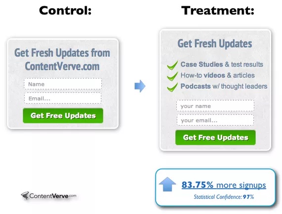
The microcopy informed users that they’d be getting case studies & test results, how-to videos & articles, and podcasts with thought leaders.
The changes gave them an 83.75% increase in conversions.
Evergage
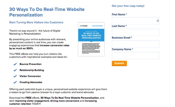
Evergage wanted to increase conversions on their landing page for Google Adwords visitors. They tested adding microcopy in the form of a brief welcome message.
Before:
After:
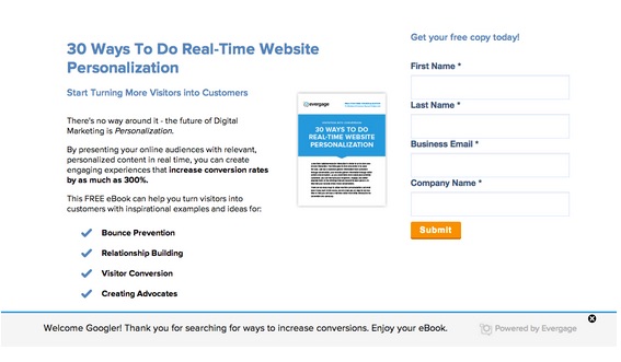
Their message reads: “Welcome Googler! Thank you for searching for ways to increase conversions. Enjoy your eBook”.
They saw an increase in conversions by 11%.
Yoast
Yoast decided to optimize their checkout pages to improve their user experience. They anticipated that their changes would also increase conversions.
Yoast made a number of changes including adding strategically placed bits of microcopy. Like the message “there will be no additional costs” and “Continue shopping”.
Before:

After:

The “no additional costs” test was added because Yoast realized that hidden costs are the #1 reason why people abandon shopping carts.
Yoast’s changes (including microcopy) increased their conversions by 11.30%.
Microcopy is everywhere
Once you’ve become aware of microcopy, you’ll start to see it everywhere. Sure, your headlines and layouts are important for directing attention that can generate conversions.
But microcopy addresses another need: user experience.
To do microcopy right, you voice the thoughts in your audience’s head. You provide reassurance and earn their trust.
And this trust is what gets you the conversion you’re looking for.
About the Author: Clement Lim helps B2B companies improve their content marketing and boost their conversion rates. Visit him at limwriter.com and download your free ebook “How to Create Content that Converts Like Crazy.” Follow him on Twitter or LinkedIn.
[ad_2]
Source link
Social Media Agency, Social Media, Digital Marketing, Digital Marketing Agency, Search Engine Marketing, SEO, digital marketing agency dubai, video content marketing, crossfit marketing dubai, video marketing dubai, digital marketing agency abu dhabi, facebook marketing dubai, facebook marketing abu dhabi, digital marketing agencies in dubai, social media agency, content marketing dubai, content strategy dubai, branding dubai

