
24 Feb How to Increase Your Mobile App Installs With A/B Testing – Part II: Tools Evolution
[ad_1]
This is a continuation from a previous post on increasing mobile app sales with A/B testing.
Green button or red button? If you’re in mobile marketing, you must have tried A/B testing and know that, at least for mobile app pages, it gets more complicated than that. Split tests work for copy, visual assets, pricing, and much more.
This article will cover the evolution of tools and methods available to mobile marketers for a/b testing app store pages. We’ll look at the pros and cons of custom coded landings, native app store developer tools, and special app page testing software. I’ll also share some of the metrics you should be looking for (beyond conversion) and tips to get started.
A/B Testing for Mobile App Pages: Creative Ideas Backed By Data
A/B testing for mobile app marketers usually means two things:
- in-app content (UI, personalization in onboarding, CTAs, etc.)
- app store pages and marketing creatives with the goal to drive new users.
While in-app a/b testing is usually done to improve app experience and engagement, app store a/b testing is meant to acquire new users with higher conversion rate and at a lower cost-per-install. On average, experiments with A/B testing for visual creatives on the app store page result in 19-26% increase in conversion, according to SplitMetrics.


The idea behind app store A/B testing is based on the following assumptions:
- App store visitors make decisions about downloading the app after a couple of seconds they spend on the app store page.
- A couple of seconds is a very short period of time to tell the app’s “story” and explain all of the product’s benefits.
- When app publishers advertise apps, a lot of money is wasted when the user gets from the campaign link to the app store page and doesn’t download, while the advertiser still pays for the click. They got the initial interest, but what went wrong?
- To optimize media spend and app marketing budget, marketers should test app store creatives before launching campaign.
Marketers can test different app page ideas by tweaking the following elements:
- Icon
- Screenshots
- Title
- Description
- Pricing
- Video preview
Some of the more recent popular a/b tests include testing app performance in search results and different categories (e.g., what if you put your game in “Action” subcategory vs. “Racing”?).
Growth Hacker’s MVP of A/B Testing: Custom Landings
The concept of a/b testing for app pages is not new. In fact, for a long time growth hackers have been on the lookout for new ways to optimize their media spend. The common approach includes the following steps:
- Create an alternative landing page for A/B testing
- Drive traffic to test the original page and the alternative page (testing pages will redirect user to the original store page after user clicks “Install” or “Get”)
- Analyze which page has a better install-per-number-of-views ratio.
Back in 2012, Peter Tanham talked about micro-testing for app store pages, and for the lack of a special marketing tool, came up with several ideas of how to go about creating an alternative page:
- Hire a developer to code a custom page that looks like the app store page you want to test
- Buy a template online and customize it to mimic app store
- Use one of the mobile site builder tools
All of these got the job done, no question here. But few marketers actually used the technique. Hiring a developer on Upwork takes time and can be expensive. You need to have some basic coding skills to customize a template. And building a mobile site even with the simplest tools still requires time and effort. All of these solutions, while perfectly viable, seemed too elaborate for A/B testing, something that’s supposed to be as easy as A and B. There really should be a better way to test your app store page!
Can’t You Just Test on Google Play?
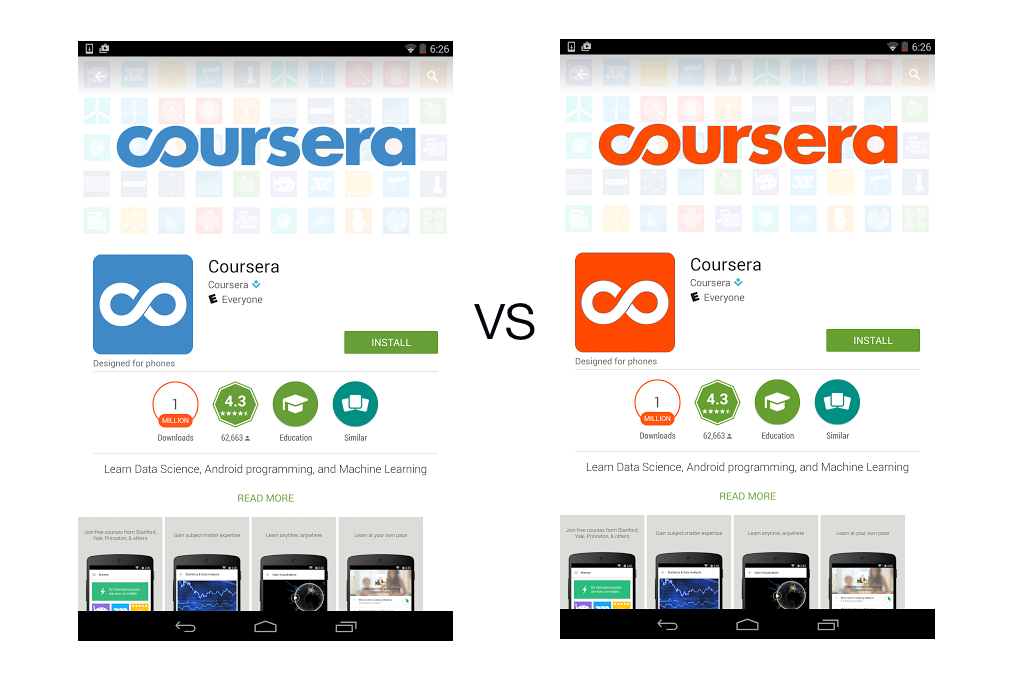
What about app stores? Shouldn’t app marketplaces allow mobile publishers to experiment with their page creatives to increase conversion and, thus, up the store revenue? For Google Play, it only became possible in May 2015 when they introduced basic A/B testing functionality for mobile publishers at the I/O developer conference in San Francisco. Google ran a pilot study on Kongregate and saw a 30% increase in conversion. That’s a lot of ad money if you consider Kongregate’s average media spend!
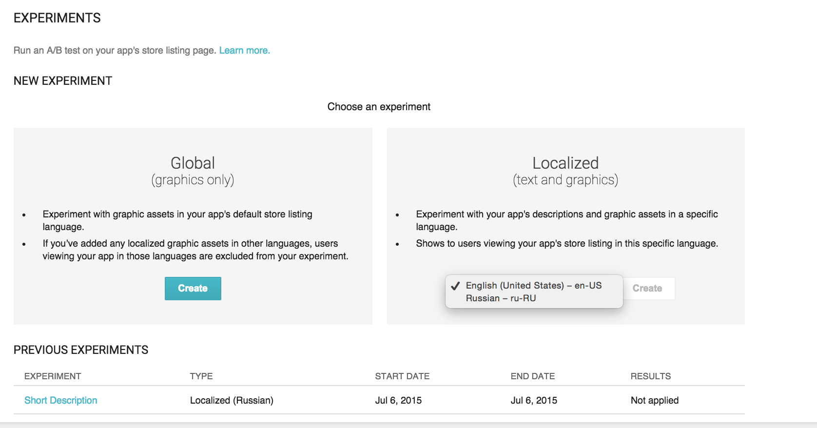
Google saw the need for app marketers to experiment with app pages, so they now include A/B testing functionality in the app developer console.
Google Play A/B testing does, however, lack certain features that are important for marketers:
- You can only run experiments on published apps. If you want to test your app concept pre-launch to experiment with design ideas and collect user emails, Google Play A/B testing won’t help.
- You can run one experiment per app at a time. If there are different elements of the page that you want to collect data for, such as localization, icons, and screenshots, you can’t do it at the same time.
- No detailed analytical data on what exactly worked. You can test which alternative overall converted better, but there are no metrics to see how visitors interacted with the page to understand what exactly worked. For example, it could be the first screenshot or the first line of the description that triggered visitor to tap “Install”, and there’s no way to tell which one of these did.
Apple’s App Store doesn’t offer native A/B testing functionality. You can only change your visual creatives with each new app update and then track changes in visit-to-install stats from the analytics board. This isn’t an “agile” process at all, as app update approval on the side of Apple review team may take weeks, and most publishers do not push updates as often as they experiment with user acquisition campaigns. You can, however, play with the app description, because you don’t need to upload a new app build to the store to change it.
Unwrapping App Store Black Box with On-Page Analytics
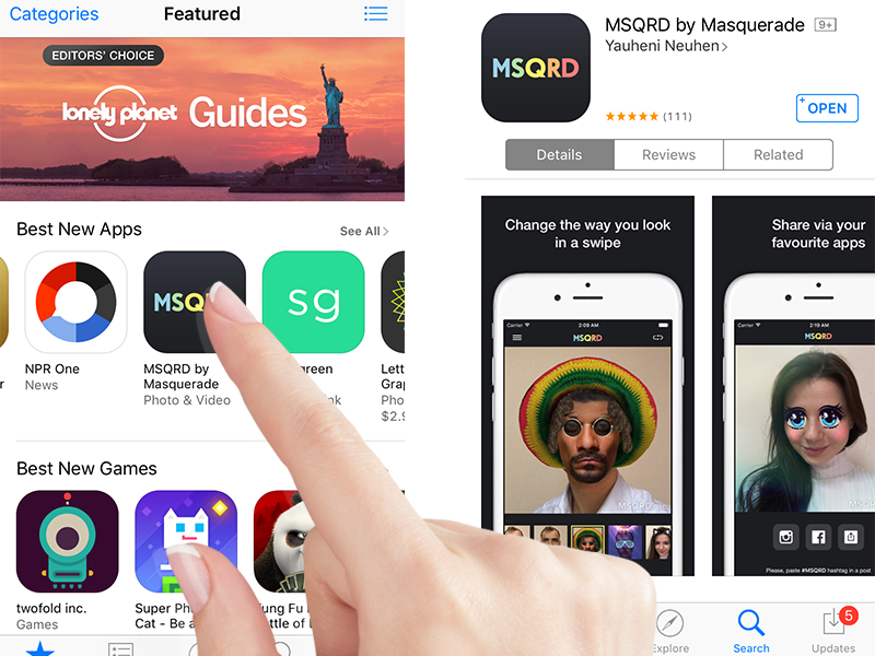
So, we’ve tried building web landings and experimenting with store developer tools. We can tell how much traffic we sent to the pages, and which one performed better. What we do not know is what visitors did on the page, how long they spent there, and which of the graphics we’ve tirelessly crafted and tested actually converted them into users. Here’s where special A/B testing tools step in.
Beyond Conversion: What Metrics Should You Look At?
Mobile marketing software tools like SplitMetrics, TestNest, Storemaven, and others is the next level of marketing A/B testing for mobile pages, with rich analytics to track visitor behavior on the page.
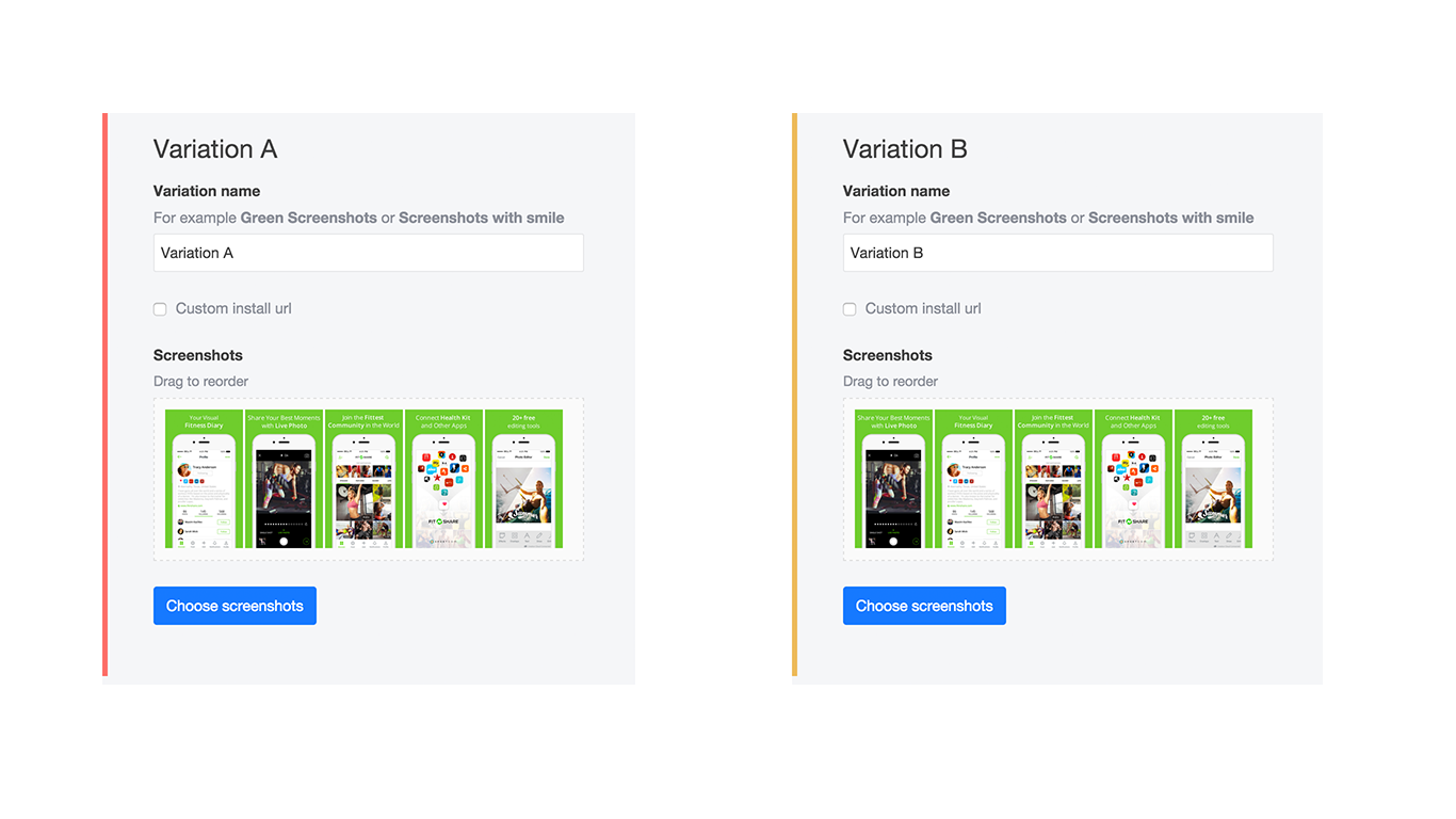
In essence, the way these tools work is you simply enter your app’s URL (if it’s already published), and their software generates a page that mimics App Store or Google Play, depending on your platform. You don’t need to write a single line of code, and the dashboard is very intuitive: You can drag and rearrange your screenshots to test order or upload new ones. In addition to the regular icon/screenshot a/b testing, such tools have pre-launch experiments for unpublished apps and search & category testing, in which you can get data on how your app performs next to your competitors. To start an experiment, you create an ad campaign (for example, on Facebook or via AdWords), then use the link generated by the A/B testing tool to drive traffic to your pages. The tool captures every scroll and click on the page to give you actionable insights about how your creatives performed.
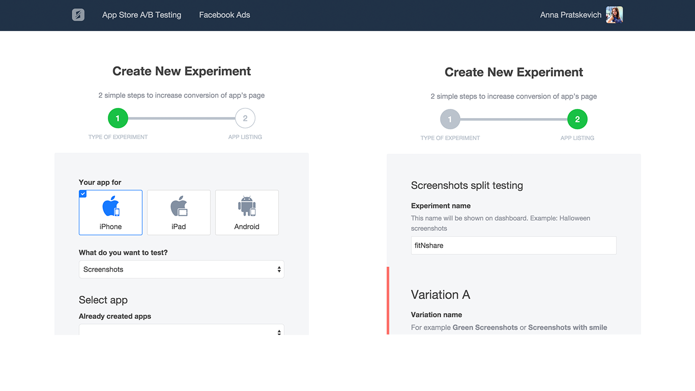

Obviously, conversion is the most important marketing metric when it comes to app store a/b testing, but there are other valuable metrics marketers can and should use to gauge the effectiveness of their app store page design.
- Bounce rate. Bounced visitors load the page and leave right away. High percentage of visitors who left the app store page as soon as they entered may signal a need for redesign. It may also mean their Internet connection was weak, so you lost them. If you segment visitors by region, you may notice that bounce rate is higher in countries with slow Internet connection (compare, for example, Bolivia and South Korea).
- Direct Installs vs. “Explored” Installs. Direct installs will show users who converted the moment they got to the page. High traffic of direct installs means people are already familiar with your app via word-of-mouth or your other marketing activities outside of the app store.
- Average session time. If users stay and engage with your page, it’s a good sign that your ad campaign segmentation is on point and you’re attracting relevant traffic.
Long time on page + high conversion =>> user clearly likes your page!
Long time on page + low conversion =>> time to rethink the design and try a strong CTA.
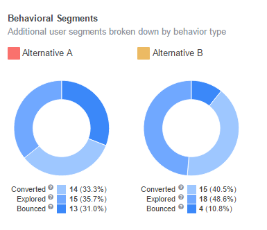
You can also test which element of the page (e.g., Screenshot #1, Screenshot #3, or “Read more” click) triggered the “aha” moment of conversion for your user.
Getting Started with A/B Testing

It’s really as easy as developing a couple of different sets of creatives and testing them one at a time. Start with your user persona and develop a couple of hypotheses what kind of app page s/he might like. Test, and then return to the drawing board to iterate.
App icon and screenshots are a good place to start. At SplitMetrics, we’ve seen an average conversion increase of 26% and a maximum of 559% after a/b testing icons. For screenshots, the average improvement has so far been 18%, with the maximum of 654%. Here are some ideas to get you thinking:
- Captions in all CAPS vs. Capital letters for each word
- Bright and bold vs. subtle tone background color
- Video preview vs. no video preview
- Landscape vs. portrait orientation
Summary
The point of A/B testing for mobile app pages is to figure out how to maximize your conversion and “get the bang for the buck” with your ad campaigns. It usually comes down to a marketer developing an alternative landing page and then testing two variations to see what performs better.
There’s a number of ways to do it: from custom-coded landings to special tools. The choice of the tool depends on how much data you want to get on your visitors. Playing and experimenting with different elements on your app store page is the way to get insights into how to create design that simply works.
About the Author: Anna Pratskevich is a marketing and content strategist based in San Francisco. She works for SplitMetrics, an A/B testing software platform for app store pages, helping mobile marketers design for better conversion and optimize their media spend.
[ad_2]
Source link
Social Media Agency, Social Media, Digital Marketing, Digital Marketing Agency, Search Engine Marketing, SEO, digital marketing agency dubai, video content marketing, crossfit marketing dubai, video marketing dubai, digital marketing agency abu dhabi, facebook marketing dubai, facebook marketing abu dhabi, digital marketing agencies in dubai, social media agency, content marketing dubai, content strategy dubai, branding dubai

