18 Dec 9 Principles of Mobile Web Design
[ad_1]

In case you missed it, we now live in a mobile-dominant world. This year, Google reported that 52% of search traffic and almost half of shopping traffic comes from mobile devices, so a compatible web design is no longer a luxury, but a necessity. In April of 2015, “Mobilegeddon” transformed the marketing world as we know it, putting responsive and mobile websites at the forefront of a marketer’s mind.
And with Google’s mobile-friendly algorithm in place, you’d expect all sites to be compatible in this day and age. But that’s simply not the case. Nearly half of marketers don’t have their websites optimized for mobile, despite the increase in search traffic and the effect on rankings.
So what gives? Has the algorithm’s impact not been significant enough to warrant a redesign? Are businesses not getting customers from mobile?
Despite the upward trend in mobile usage, it’s important that we don’t discount desktop users. Time on site and number of pages viewed are three times greater on desktop than on mobile devices, and desktop is the preferred technology for reading news and watching videos.
These figures are certainly too significant to ignore, and it sheds an important light on mobile user behavior as well. Due to smaller screen sizes and often being on the go when using a mobile device, consumers are coming to a website with a clear plan of action. If the site they visit can’t give them the information they need quickly, they’ll go find one that can. This means that you have to provide them with what they’re looking for right off the bat; there’s no time to waste.
With that in mind, many designers are building websites with a mobile-first mentality, ensuring that pages aren’t bogged down with long load times, too many graphics, or content that requires a user to zoom in and out to read. If your site isn’t mobile-friendly yet, don’t panic. Redesigning a website to fit a responsive design, or creating a separate mobile site altogether, isn’t as complicated as you might think! There are plenty of builders out there that can do the job, likely the one your current site is built in.
Whether your business has fully adopted a mobile strategy or you’re still figuring out the best route to take, make sure you keep these principles of mobile web design in mind.
1) Make Menus Simple and Concise
On a mobile device or tablet, you can’t expect users to scroll through a large menu or click through to multiple sub-menus. There just isn’t enough space on the screen to process it all. It’s important that menus contain a high-level overview of the products and services you offer to allow visitors to narrow down what they’re looking for. From there, they can click to a specific category or utilize the search feature to filter their results further.
The ideal menu has no more than 5-6 items, giving users just enough information to guide their search. There should also be no more than two sub-menus within the main menu, if they are necessary at all. In terms of style, the “hamburger” menu ( ) has been widely adopted, so you don’t need to say “Menu” for users to know where it’s located. Other companies have added their own twist to the traditional menu, like Carrabba’s.
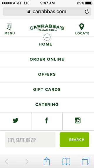
On their mobile site, they have a simple dropdown below their logo, which unfolds five options. Since the restaurant menu and location finder are already located in the header, they don’t need a place in the list. They’ve effectively kept their menu simple and featured the most important elements of their website front and center.
When you’re coming to a restaurant’s website, you’re likely looking to do one of a few things: check out their menu, find a location, or order online. Carrabba’s site allows you to accomplish all of these things quickly and easily, without bogging you down in sub-menus full of appetizers, pasta dishes, and happy hour specials.
2) Keep Forms Short and Sweet
When it comes to completing contact forms on mobile, users are not interested in filling out field after field of information. For those situations, they’ll likely opt for a desktop or laptop. That’s why it’s even more important that you only ask for information that is absolutely necessary to accomplish the task.
If your contact form is to sign up for a newsletter, you shouldn’t ask the user for more than a name and email address. Even for payment forms, try to keep the number of form fields to a minimum. Consumers understand that more information is necessary to make a purchase, but it’s important that you’re sensitive of their time, especially if you receive a lot of mobile traffic.
In order to determine the ideal number of form fields, A/B test by changing or removing one field at a time to assess the impact on completion rates. For example, people are more likely to fill out a form if you don’t require their phone number, so try testing your form with and without that field or compare it as a required vs. optional field to see how it performs. Then compare these results to the actual ROI earned through each method to determine whether or not you should include it.
MasterCard is a great example of a company that utilizes contact forms while being thoughtful of a mobile user’s time. To reach their support team, the only required fields are first name, last name, email address, topic, and comments. This gives them just enough information to look up your account and direct your inquiry to the right department, without being too time-consuming or invasive.
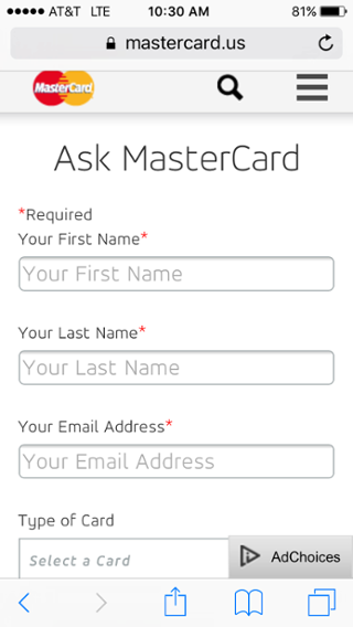
They also give you the option to provide more information like phone number, type of card, and financial institution, so that if you do want to include any or all of these details, you can. But if not, you can still have your question or need addressed. Consumers are especially protective of financial information, so giving them this freedom not only caters to their mobile needs, but helps build trust.
3) Simplify Form Fields
In addition to form length, the types of questions you ask shouldn’t require too much input from users. It’s important that you utilize different field types in your form, such as dropdowns, checkboxes, and calendars. These are especially useful when typing in payment or shipping information, as well as booking travel.
You also want to provide as much clarity as possible in your form, making it obvious which pieces of information are required and which are optional. To make things easier for returning customers, utilize autofill to expedite the purchasing process, and offer guest checkout to new customers who don’t want to make an account.
It’s essential that companies in the travel industry take advantage of simple forms to aid potential customers in the search process. Expedia is a perfect example of this, featuring easy-to-see buttons and requiring very few fields to conduct a search.
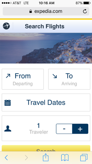
When searching for a flight, if you click on the “From” or “To” buttons, they will suggest locations as you type a city or airport code so you don’t have to type in the whole thing. They also make the calendar feature much easier than some other sites, allowing you to see the calendar and click your departure and arrival dates on the same screen.
4) Catch Your Visitor’s Eye with CTAs
Calls-to-action are an essential part of any web design, but they play an especially important role on mobile. Since, as opposed to their desktop counterparts, mobile users typically have more of an idea of what they’re looking for when they come to your site, make it as easy to find as possible with CTAs placed in the most valuablereal estate.
Ideally, they should be located above the fold, use contrasting colors or fonts to make them stand out (within reason, of course), and clearly state what the offer is for. The following steps should be laid out clearly so you don’t leave visitors wondering what they need to do next.
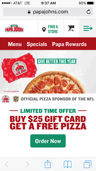
Papa John’s uses their homepage’s prime real estate to focus on a holiday promotion, which encourages visitors to pick up a gift for family or friends while they place an order online. The text is bold and stands out from the page, while still fitting with their color scheme and branding. And most importantly, you know what you’regetting if you click on the CTA. They don’t try to sugarcoat it with flowery language or fine print, so users can quickly get in, get out, and get their favorite pizza in a snap.
5) Bring Users the Search Results They Want
Site search is especially important to mobile users that come with a specific plan of action in mind. They’re less likely to dabble with vague menus or scroll through page after page of products. That’s why it’s all the more important that your search results provide exactly what the visitor is looking for on the first page. Once a user completes a search, provide filter options so that they can sort the results as it best pertains to them (e.g. price, relevance, top sellers, etc.).
It’s also important to feature an image, price, and short description with each item so that the results pages aren’t bogged down with text and the user doesn’t have to click on several products to find the right one. The images should be clickable and expand within the same window to help visitors get a better view of the product without having to go all the way to its individual page. Then when they do find what they’re looking for, they can click on that particular item to learn more and purchase.
In a search for “Hoodies” on Under Armour’s website, you’re presented with several filtering options to narrow down the 371 results. You canselect by department, filter by price or size,or sort the options to see the highest rated or lowest priced products at the top.
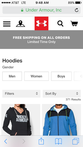
This is an area where consumers prefer having more options so they can have a more direct search path and only spend time looking at items that are most relevant to them. The page provides you with ample information to help you proceed with your search, and is presented in a way that’s clean and not overwhelming to a mobile screen.
6) Make It Easy to Contact You
With any ecommerce site, the ability to quickly contact a company is essential. If you have any questions or issues with an order, you want to make sure they can be answered or resolved in a timely manner. For mobile users, this means having a click-to-call feature prominently displayed on the website. This, along with a contact form or email address, will give visitors options so that they can contact you in the way that best fits their preferences and the urgency of their need.
It’s also helpful to have an FAQs page to give users the ability to seek answers to questions they have without requiring them to actually contact you. Most consumers would agree that if they can figure it out on their own, they would rather do so.
Another mobile-focused way to provide easy contact is by embedding a Google Map of your location onto your site. Allowing visitors to click on the map, zoom in and out, and search for directions from the Google Maps app will make sure that they have no trouble finding your brick-and-mortar location if you have one.
Online retailer Zappos understands the importance of being able to contact them quickly and easily to inquire about an order, returns, and promotions. That’s why they have a click-to-call customer service number displayed above the fold on the homepage. This way, customers that need immediate support can take one step to contact them directly without having to dig around the entire website to find the Contact Us page.
7) Design with Thumbs in Mind
By far the most common complaints users have about non mobile-friendly sites are that the buttons are too small to click on and text is hard to read. The foundation of responsive or mobile website design is that there is no need for zooming in and out to read content or click on a link. So when you’re designing your web pages, make sure that each button is large enough to be clicked on, and that they’re not spaced so close together that you might accidentally click on something you didn’t want to.
And don’t require visitors to pinch the screen to make text legible, just to have to zoom back out to click on another link or page. As a rule of thumb (no pun intended), the minimum tap area to accommodate a user’s thumbs should be 44px by 44px. It might be hard to adapt to every smartphone’s screen size, but it’s generally advised that you try to design your site with a few older models in mind, since older phones tend to have smaller screens. That way you can ensure that your content is easily visible across platforms.
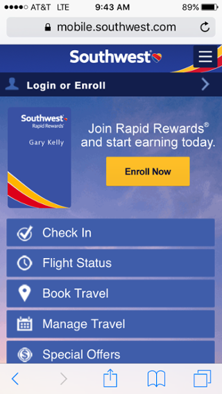
The buttons on Southwest Airlines’ mobile site are easily clickable, and there’s no issue trying to read what the buttons have to say. Allowing them to take up (almost) the entire width of the screen makes it compatible to any user, and also provides them with a limited number of options to guide their search. You aren’t distracted by extra text or multiple CTAs so you can focus on why you came to the site in the first place: to search for a flight or manage current orders.
8) (Load) Time is Precious
As consumers, our patience is wearing thinner by the day. For mobile users, even more so. Since many are accessing your website on the go, it’s important that you don’t leave them waiting around for pages to load. Your site should be able to accommodate both WiFi and non-WiFi connections equally, ideally loading a page in less than four seconds.
Over half of mobile users expect a site to load in four seconds or less, and 80% are unhappy with the current browsing speed on smartphones. That’s a lot of potential customers bouncing from your website due to something that is almost entirely controllable (barring poor cell reception). Some goals to keep in mind for mobile web designers are to keep the entire site’s size under 1MB and use images and videos wisely. The more visual content you have, the slower your website will likely be.
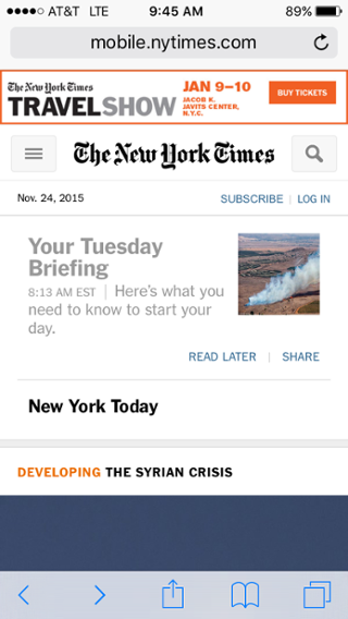
For businesses in the news or publishing industries, they understand that consumers are looking to get the information they need quickly. The New York Times’ mobile site loads almost instantly, even without a WiFi connection. A lot of mobile users check their favorite news outlets when they only have a minute or two to spare, and just want to get caught up on the happenings of the day. The New York Times is able to deliver trending stories from a variety of categories, and they’re able to do so with a very swift load time.
9) Avoid Pop-Ups If You Can
In general, users aren’t huge fans of pop-up ads or surveys, let alone on a mobile device. Oftentimes, the box to close them out is so small that you have to zoom in to do so or you may accidentally click on an ad when you didn’t want to. Time is of the essence for mobile users, so using pop-ups simply gets in the way.
This is also an area where companies that feature publications or allow users to subscribe to content have to pay attention. It can be tempting to include a pop-up to encourage people to sign up for email alerts or a newsletter, but the reality is that most mobile users aren’t looking for that. If they want to sign up for something, they probably already know that they want to and will take the necessary steps on your website to find that form.
BuzzFeed’s site on both desktop and mobile features sponsored posts and ads, but they don’t use any pop-ups to try and get you to click through or sign up for one of their several newsletters (“Dog A Day” newsletter, anyone?).
In the screenshot below, you can see that their post “15 Tiny Ways to Take Yourself Less Seriously” is sponsored by Captain Morgan, but by clicking on the post you aren’t faced with an annoying pop-up. If you want to click on the hyperlink to Captain Morgan’s website, you can, but there’s no opting out necessary. BuzzFeed does the same with CTAs for its newsletters. They give users the ability to opt-in, but don’t force them to view content they don’t want to look at.
Does Your Web Design Fit the Mobile Mold?
With the prominence of mobile search and greater buyer intent on mobile devices, this is certainly a trend that you can’t afford to sit out on. Mobile’s influence on marketing and buyer behavior is on the rise, and there’s no sign of it slowing down. If you’ve decided to revamp your desktop site, you should prioritize compatibility across devices through responsive design or a separate mobile site. As marketers we must possess a mobile-first mentality, or risk having our business fall not only in search rankings, but in consumers’ minds.
[ad_2]
Source link
Social Media Agency, Social Media, Digital Marketing, Digital Marketing Agency, Search Engine Marketing, SEO, digital marketing agency dubai, video content marketing, crossfit marketing dubai, video marketing dubai, digital marketing agency abu dhabi, facebook marketing dubai, facebook marketing abu dhabi, digital marketing agencies in dubai, social media agency, content marketing dubai, content strategy dubai, branding dubai


